COVID-19 分析
疫情数据分析实战
应用篇library(tidyverse)
library(lubridate)
library(maps)
library(viridis)
library(ggrepel)
library(paletteer)
library(shadowtext)
library(showtext)
showtext_auto()新型冠状病毒(COVID-19)疫情在多国蔓延,本章通过分析疫情数据,了解疫情发展,祝愿人类早日会战胜病毒!
数据来源
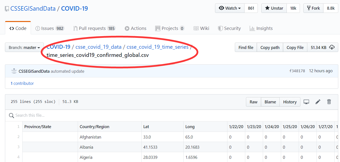
我们打开链接https://github.com/CSSEGISandData/COVID-19,

找到疫情时间序列数据,你可以通过点击该网页Clone or download直接下载的方式获取数据。
读取数据
假定你已经下载了数据,比如time_series_covid19_confirmed_global.csv, 那么我们可以用readr::read_csv()函数直接读取, 关于在R语言里文件读取的方法可以参考相关章节。
d <- read_csv("./demo_data/time_series_covid19_confirmed_global.csv")
d
数据集结构
探索数据之前,我们一定要对数据存储结构、数据变量名及其含义要非常清楚,重要的事情说三遍。
glimpse(d)数据清洗规整
必要的预备知识之select()
d %>% select(-c(1:4))
d %>% select(5:ncol(.))
d %>% select(matches("/20"))
d %>% select(ends_with("/20"))
应该还有其他的方法。
必要的预备知识之pivot_longer()
宽表格变长表格,需要用到pivot_longer() 和 pivot_wider(), 比如
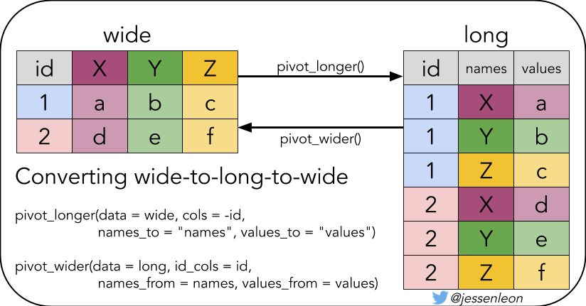
table4alonger <- table4a %>%
pivot_longer(
cols = `1999`:`2000`,
names_to = "year",
values_to = "cases"
)
longer必要的预备知识之pivot_wider()
有时候我们想折腾下,比如把长表格再变回宽表格
longer %>%
  pivot_wider(
    names_from = year,
    values_from = cases
  )
必要的预备知识之日期格式
有时候,我会遇到日期date这种数据类型,我推荐使用lubridate包来处理,比如
c("2020-3-25", "20200325", "20-03-25", "2020 03 25") %>% lubridate::ymd()c("3/25/20", "03-25-20", "3-25/2020") %>% lubridate::mdy()遇到这种010210日期的,请把输入数据的人扁一顿,他会告诉你的
lubridate::dmy(010210)
lubridate::dym(010210)
lubridate::mdy(010210)
lubridate::myd(010210)
lubridate::ymd(010210)
lubridate::ydm(010210)
必要的预备知识之时间差
difftime(ymd("2020-03-24"),
  ymd("2020-03-23"),
  units = "days"
)
或者更直观的表述
ymd("2020-03-24") - ymd("2020-03-23")转换为天数
(ymd("2020-03-24") - ymd("2020-03-23")) %>% as.numeric()有时候需要log10_scale
tb <- tibble(
  days_since_100 = 0:18,
  cases = 100 * 1.33^days_since_100
)


p1 <- tb %>%
  ggplot(aes(days_since_100, cases)) +
  geom_line(size = 0.8) +
  geom_point(pch = 21, size = 1)

p2 <- tb %>%
  ggplot(aes(days_since_100, log10(cases))) +
  geom_line(size = 0.8) +
  geom_point(pch = 21, size = 1)


p3 <- tb %>%
  ggplot(aes(days_since_100, cases)) +
  geom_line(size = 0.8) +
  geom_point(pch = 21, size = 1) +
  scale_y_log10()

library(patchwork)
p1 + p2 + p3
数据清洗规整
d1 <- d %>%
  pivot_longer(
    cols = 5:ncol(.),
    names_to = "date",
    values_to = "cases"
  ) %>%
  mutate(date = lubridate::mdy(date)) %>%
  janitor::clean_names() %>%
  group_by(country_region, date) %>%
  summarise(cases = sum(cases)) %>%
  ungroup()

d1d1 %>%
group_by(date) %>%
summarise(confirmed = sum(cases))【WHO:2019冠状病毒全球大流行正在“加速”】世界卫生组织(WHO)昨日发出警告,指2019冠状病毒全球感染者已超过30万人,全球大流行正在“加速”。世卫组织指,从首例病例报告到感染者达到10万人用了67天;感染人数增至20万用了11天;从20万到突破30万则只用了4天。
d1 %>%
  group_by(date) %>%
summarise(confirmed = sum(cases)) %>%
ggplot(aes(x = date, y = confirmed)) +
geom_point() +
scale_x_date(
date_labels = "%m-%d",
date_breaks = "1 week"
) +
scale_y_continuous(
breaks = c(0, 50000, 100000, 200000, 300000, 500000, 900000),
labels = scales::comma
)# d1 %>% distinct(country_region) %>% pull(country_region)
d1 %>% distinct(country_region)d1 %>%
filter(country_region == "China")d1 %>%
filter(country_region == "China") %>%
ggplot(aes(x = date, y = cases)) +
geom_point() +
scale_x_date(date_breaks = "1 week", date_labels = "%m-%d") +
scale_y_log10(labels = scales::comma)d1 %>%
group_by(country_region) %>%
filter(max(cases) >= 20000) %>%
ungroup() %>%
ggplot(aes(x = date, y = cases, color = country_region)) +
geom_point() +
scale_x_date(date_breaks = "1 week", date_labels = "%m-%d") +
scale_y_log10() +
facet_wrap(vars(country_region), ncol = 2) +
theme(
axis.text.x = element_text(angle = 45, hjust = 1)
) +
theme(legend.position = "none")可视化探索
网站https://www.ft.com/coronavirus-latest 这张图很受关注,于是打算重复
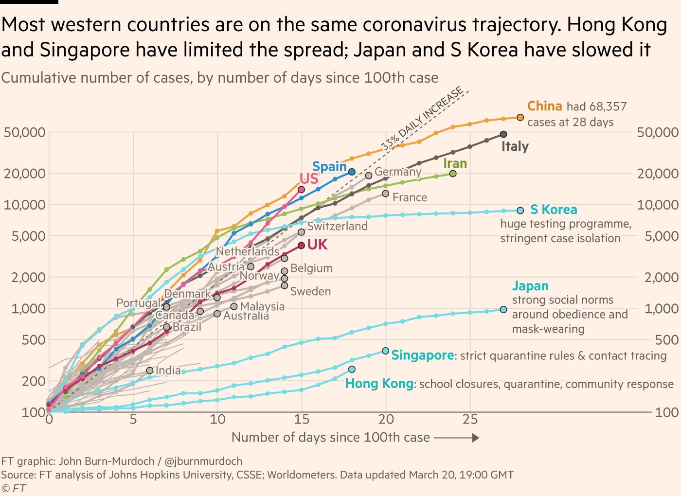
这张图想表达的是,出现100个案例后,各国确诊人数的爆发趋势
- 横坐标是天数,即在出现100个案例后的第几天
- 纵坐标是累积确诊人数
那么,我们需要对数据的时间轴做相应的变形
- 首先按照国家分组
- 筛选,累积确诊人数超过
100的国家 - 找到所有
case >= 100的日期,date[cases >= 100] - 最早的日期,就说我们要找的第 0 day,
min(date[cases >= 100]) - 构建新的一列
mutate( days_since_100 = date - min(date[cases >= 100]) - 将
days_since_100转换成数值型as.numeric()
d2 <- d1 %>%
group_by(country_region) %>%
filter(max(cases) >= 100) %>%
mutate(
days_since_100 = date - min(date[cases >= 100])
) %>%
mutate(days_since_100 = as.numeric(days_since_100)) %>%
filter(days_since_100 >= 0) %>%
ungroup()
d2::: {.rmdnote} 大家都谈过恋爱,也有可能失恋。大家失恋时间是不同的,若把失恋的当天作为第 0 day, 就可以比较失恋若干天后每个人精神波动情况。参照《失恋33天》
:::
d2_most <- d2 %>%
group_by(country_region) %>%
top_n(1, days_since_100) %>%
filter(cases >= 10000) %>%
ungroup() %>%
arrange(desc(cases))
d2_mostd2 %>%
bind_rows(
tibble(country = "33% daily rise", days_since_100 = 0:30) %>%
mutate(cases = 100 * 1.33^days_since_100)
) %>%
ggplot(aes(days_since_100, cases, color = country_region)) +
geom_hline(yintercept = 100) +
geom_vline(xintercept = 0) +
geom_line(size = 0.8) +
geom_point(pch = 21, size = 1) +
# scale_colour_manual(
# values = c(
# "US" = "#EB5E8D",
# "Italy" = "black",
# "Spain" = "#c2b7af",
# "China" = "red",
# "Germany" = "#c2b7af",
# "France" = "#c2b7af",
# "Iran" = "#9dbf57",
# "United Kingdom" = "#ce3140",
# "Korea, South" = "#208fce",
# "Japan" = "#208fce",
# "Singapore" = "#1E8FCC",
# "33% daily rise" = "#D9CCC3",
# "Switzerland" = "#c2b7af",
# "Turkey" = "#208fce",
# "Belgium" = "#c2b7af",
# "Netherlands" = "#c2b7af",
# "Austria" = "#c2b7af",
# "Hong Kong" = "#1E8FCC",
# # gray
# "India" = "#c2b7af",
# "Switzerland" = "#c2b7af",
# "Belgium" = "#c2b7af",
# "Norway" = "#c2b7af",
# "Sweden" = "#c2b7af",
# "Austria" = "#c2b7af",
# "Australia" = "#c2b7af",
# "Denmark" = "#c2b7af",
# "Canada" = "#c2b7af",
# "Brazil" = "#c2b7af",
# "Portugal" = "#c2b7af"
# )
# ) +
geom_shadowtext(
data = d2_most, aes(label = paste0(" ", country_region)),
bg.color = "white"
) +
scale_y_log10(
expand = expansion(mult = c(0, .1)),
breaks = c(100, 200, 500, 1000, 2000, 5000, 10000, 20000, 50000),
labels = scales::comma
) +
scale_x_continuous(
expand = expansion(mult = c(0, .1)),
breaks = c(0, 5, 10, 15, 20, 25, 30)
) +
theme_minimal() +
theme(
panel.grid.minor = element_blank(),
plot.background = element_rect(fill = "#FFF1E6"),
legend.position = "none",
panel.spacing = margin(3, 15, 3, 15, "mm")
) +
labs(
x = "Number of days since 100th case",
y = "",
title = "Country by country: how coronavirus case trajectories compare",
subtitle = "Cumulative number of cases, by Number of days since 100th case",
caption = "data source from @www.ft.com"
)有点乱,还有很多细节没有实现,后面再弄弄了
简便的方法
d2a <- d1 %>%
group_by(country_region) %>%
filter(cases >= 100) %>%
mutate(days_since_100 = 0:(n() - 1)) %>%
# same as
# mutate(edate = as.numeric(date - min(date)))
ungroup()
d2a这里的d2a 和d2是一样的了,但方法简单很多。
疫情持续时间最久的国家
d3 <- d2a %>%
  group_by(country_region) %>%
  filter(days_since_100 == max(days_since_100)) %>%
  # same as
  # top_n(1, days_since_100) %>%
  ungroup() %>%
  arrange(desc(days_since_100))
d3highlight <- d3 %>%
top_n(10, days_since_100) %>%
pull(country_region)
highlightd2a %>%
bind_rows(
tibble(country = "33% daily rise", days_since_100 = 0:30) %>%
mutate(cases = 100 * 1.33^days_since_100)
) %>%
ggplot(aes(days_since_100, cases, color = country_region)) +
geom_hline(yintercept = 100) +
geom_vline(xintercept = 0) +
geom_line(size = 0.8) +
geom_point(pch = 21, size = 1) +
scale_y_log10(
expand = expansion(mult = c(0, .1)),
breaks = c(100, 200, 500, 1000, 2000, 5000, 10000, 20000, 50000, 100000),
labels = scales::comma
) +
scale_x_continuous(
expand = expansion(mult = c(0, .1)),
breaks = c(0, 5, 10, 15, 20, 25, 30, 40, 50, 60)
) +
theme_minimal() +
theme(
panel.grid.minor = element_blank(),
plot.background = element_rect(fill = "#FFF1E6"),
legend.position = "none",
panel.spacing = margin(3, 15, 3, 15, "mm")
) +
labs(
x = "Number of days since 100th case",
y = "",
title = "Country by country: how coronavirus case trajectories compare",
subtitle = "Cumulative number of cases, by Number of days since 100th case",
caption = "data source from @www.ft.com"
) +
gghighlight::gghighlight(country_region %in% highlight,
label_key = country_region, use_direct_label = TRUE,
label_params = list(segment.color = NA, nudge_x = 1),
use_group_by = FALSE
)灰色线条的国家名,有点不好弄,在想办法
笨办法吧
笨办法,实际上是4张表共同完成
highlight <- c(
  "China", "Spain", "US", "United Kingdom", "Korea, South",
  "Italy", "Japan", "Singapore", "Germany", "France", "Iran"
)

gray <- c(
  "India", "Switzerland", "Belgium", "Netherlands",
  "Sweden", "Austria", "Australia", "Denmark",
  "Canada", "Brazil", "Portugal"
)

d3_highlight <- d2a %>% filter(country_region %in% highlight)

d3_gray <- d2a %>% filter(country_region %in% gray)d2a %>%
ggplot(aes(days_since_100, cases, group = country_region)) +
geom_hline(yintercept = 100) +
geom_vline(xintercept = 0) +
geom_line(size = 0.8, color = "gray70") +
geom_point(pch = 21, size = 1, color = "gray70") +
# highlight country
geom_line(data = d3_highlight, aes(color = country_region)) +
geom_point(data = d3_highlight, aes(color = country_region)) +
geom_text(
data = d3_highlight %>%
group_by(country_region) %>%
top_n(1, days_since_100) %>%
ungroup(),
aes(color = country_region, label = country_region),
hjust = 0,
vjust = 0,
nudge_x = 0.5
) +
# gray country
geom_text(
data = d3_gray %>%
group_by(country_region) %>%
top_n(1, days_since_100) %>%
ungroup(),
aes(label = country_region),
color = "gray50",
hjust = 0,
vjust = 0,
nudge_x = 0.5
) +
geom_point(
data = d3_gray %>%
group_by(country_region) %>%
top_n(1, days_since_100) %>%
ungroup(),
size = 2,
color = "gray50"
) +
scale_y_log10(
expand = expansion(mult = c(0, .1)),
breaks = c(100, 200, 500, 2000, 5000, 10000, 20000, 50000, 100000, 150000),
labels = scales::comma
) +
scale_x_continuous(
expand = expansion(mult = c(0, .1)),
breaks = c(0, 5, 10, 15, 20, 25, 30, 40, 50, 60)
) +
theme_minimal() +
theme(
panel.grid.minor = element_blank(),
plot.background = element_rect(fill = "#FFF1E6"),
legend.position = "none",
panel.spacing = margin(3, 15, 3, 15, "mm")
) +
labs(
x = "Number of days since 100th case",
y = "",
title = "Country by country: how coronavirus case trajectories compare",
subtitle = "Cumulative number of cases, by Number of days since 100th case",
caption = "data source from @www.ft.com"
)差强人意,再想想有没有好的办法
比较tidy的方法
对数据框d2a增加两列属性(有无标签,有无颜色),然后手动改颜色
highlight_country <- d2a %>%
  group_by(country_region) %>%
  filter(days_since_100 == max(days_since_100)) %>%
  ungroup() %>%
  arrange(desc(days_since_100)) %>%
  top_n(10, days_since_100) %>%
  pull(country_region)

highlight_country## Colors
cgroup_cols <- c(prismatic::clr_darken(paletteer_d("ggsci::category20_d3"), 0.2)[1:length(highlight_country)], "gray70")
scales::show_col(cgroup_cols)d2a %>%
group_by(country_region) %>%
filter(max(days_since_100) > 9) %>%
mutate(
end_label = ifelse(days_since_100 == max(days_since_100), country_region, NA_character_)
) %>%
mutate(end_label = case_when(country_region %in% highlight_country ~ end_label,
TRUE ~ NA_character_),
cgroup = case_when(country_region %in% highlight_country ~ country_region,
TRUE ~ "ZZOTHER")) %>% # length(highlight_country) + gray
ggplot(aes(x = days_since_100, y = cases,
color = cgroup, label = end_label,
group = country_region)) +
geom_line(size = 0.8) +
geom_text_repel(nudge_x = 1.1,
nudge_y = 0.1,
segment.color = NA) +
guides(color = FALSE) +
scale_color_manual(values = cgroup_cols) +
scale_y_continuous(labels = scales::comma_format(accuracy = 1),
breaks = 10^seq(2, 8),
trans = "log10"
) +
labs(x = "Days Since 100 Confirmed Death",
y = "Cumulative Number of Deaths (log10 scale)",
title = "Cumulative Number of Reported Deaths from COVID-19, Selected Countries",
subtitle = "Cumulative number of cases, by Number of days since 100th case",
caption = "data source from @www.ft.com")感觉这样是最好的方案。
每个国家的情况
d2 %>%
  group_by(country_region) %>%
  filter(max(cases) >= 1000) %>%
ungroup()d2 %>%
group_by(country_region) %>%
filter(max(cases) >= 1000) %>%
ungroup() %>%
ggplot(aes(days_since_100, cases)) +
geom_line(size = 0.8) +
geom_line(
data = d2 %>% rename(country = country_region),
aes(days_since_100, cases, group = country),
color = "grey"
) +
geom_point(pch = 21, size = 1, color = "red") +
scale_y_log10(
expand = expansion(mult = c(0, .1)),
breaks = c(100, 1000, 10000, 50000)
) +
scale_x_continuous(
expand = expansion(mult = c(0, 0)),
breaks = c(0, 5, 10, 20, 30, 50)
) +
facet_wrap(vars(country_region), scales = "free_x") +
theme(
panel.background = element_rect(fill = "#FFF1E6"),
plot.background = element_rect(fill = "#FFF1E6")
) +
labs(
x = "Number of days since 100th case",
y = "",
title = "Outbreak are now underway in dozens of other countries, with some on the same trajectory as Italy",
subtitle = "Cumulative number of cases, by Number of days since 100th case",
caption = "data source from @www.ft.com"
)地图
library(countrycode)
# countrycode('Albania', 'country.name', 'iso3c')

d2_newest %>%
  mutate(ISO3 = countrycode(country_region,
    origin = "country.name", destination = "iso3c"
  ))
我们选取最新的日期
d_newest <- d %>%
  select(Long, Lat, last_col()) %>%
  set_names("Long", "Lat", "newest_date")
d_newestworld <- map_data("world")
ggplot() +
geom_polygon(
data = world,
aes(x = long, y = lat, group = group),
fill = "grey", alpha = 0.3
) +
geom_point(
data = d_newest,
aes(x = Long, y = Lat, size = newest_date, color = newest_date),
stroke = F, alpha = 0.7
) +
scale_size_continuous(
name = "Cases", trans = "log",
range = c(1, 7),
breaks = c(1, 20, 100, 1000, 50000),
labels = c("1-19", "20-99", "100-999", "1,000-49,999", "50,000+")
) +
scale_color_viridis_c(
option = "inferno",
name = "Cases",
trans = "log",
breaks = c(1, 20, 100, 1000, 50000),
labels = c("1-19", "20-99", "100-999", "1,000-49,999", "50,000+")
) +
theme_void() +
guides(colour = guide_legend()) +
labs(
title = "Mapping the coronavirus outbreak",
subtitle = "",
caption = "Source: JHU Unviersity, CSSE; FT research @www.FT.com"
) +
theme(
legend.position = "bottom",
text = element_text(color = "#22211d"),
plot.background = element_rect(fill = "#ffffff", color = NA),
panel.background = element_rect(fill = "#ffffff", color = NA),
legend.background = element_rect(fill = "#ffffff", color = NA)
)更多
- 参考 (https://www.ft.com/coronavirus-latest)
- (https://covid19datahub.io/)
# remove the objects
rm(
  cgroup_cols, d, d_newest, d1,
  d2, d2_most, d2a, d3,
  d3_gray, d3_highlight, gray, highlight,
  highlight_country, longer, p1, p2,
  p3, tb, world
)pacman::p_unload(pacman::p_loaded(), character.only = TRUE)